After Hours Sets the Mood for a Listening Corner
A listening corner is one of the few parts of a home that can reasonably be arranged around staying put. There is a chair, somewhere for records, and perhaps a lamp you can reach without getting up. The picture on the wall belongs to that slower pace. After Hours 01 uses a navy field, a coral circle and a broad pink-and-red form to create an image that remains legible without supplying much narrative. You can call it a sunset, a stage light or neither. It will not object.
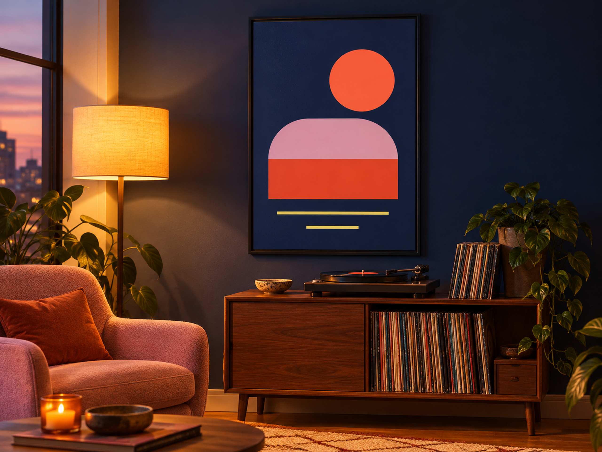
Our evening room concept places the poster over a low walnut record cabinet. A turntable occupies the left side of the top, with records standing to its right and more sleeves stored below. A dusty pink armchair sits in the foreground beside a tall lamp with an amber shade. Through the window, the sky has shifted toward lavender and orange. The wall behind the poster is navy, allowing the print’s dark ground to settle into the room while the coral circle becomes the brightest graphic element. Two slim yellow lines sit beneath the rounded pink and red mass, like a pair of quiet underlines.
The scene is an AI-generated illustration, so its light is a design proposal rather than evidence of how a particular ink or paper performs. What it usefully demonstrates is a relationship: a dark picture can remain distinct against a dark wall if its internal shapes have enough contrast and its frame gives the edge some definition. Here, the narrow black frame provides that boundary. The coral and pink are large, uncomplicated areas, and the yellow lines introduce a different pace near the bottom. Fine navy-on-black details would have been much less useful for this purpose.
Look at the flat artwork and the room view together. The flat preview is the reference for the design’s colors and proportions; the illustrated room suggests how those colors might participate in an evening scheme. The pink chair picks up the broad upper curve, while the warm wood and lamp are related to the coral without matching it literally. The wall carries the navy beyond the paper. That last choice is optional. On a pale wall, the same poster would read as a more self-contained dark rectangle, with greater contrast at its perimeter. Both arrangements are plausible, but their effect on the corner would differ quite substantially.

The cabinet supplies the main horizontal reference for placement. I would judge the frame in relation to the cabinet’s whole width, while also checking the turntable lid in its open position. In a real installation, that practical detail can matter more than an abstract rule about hanging height. A 40 by 60 centimeter image area is one possible starting point for a modest cabinet; a 50 by 75 image is a larger interpretation of the same 2:3 composition. Add the actual frame dimensions before testing either. These are worked examples, and the generated scene should not be used as a measuring drawing.
Lighting deserves a test in the room you use at night. Stand or sit where you normally listen and look for reflections from lamps and windows in the proposed glazing position. Moving a lamp sideways may change the reflected bright patch more usefully than changing the picture’s height. When choosing glazing or lighting equipment, check the product specifications rather than assuming a label will solve every reflection. This concept uses a shaded lamp to make the corner visually warm, but it does not demonstrate a tested lighting installation or make a claim about color accuracy. A physical sample under your own lamp remains more informative than a screen image.
I would resist adding too many objects that repeat the poster’s shapes. A circular lamp, circular cushion, coral bowl and pink rug could turn a relaxed corner into a visual checklist. The records already supply plenty of smaller rectangles and changing colors. Let those lived-in details remain. The picture can offer one clear graphic statement above them while the chair and cabinet do their ordinary jobs. If you prefer daylight and a lighter background, Quiet Signals in a reading corner explores a different balance of stillness and contrast. After Hours is the collection for leaving the overhead light off and choosing one more record.