Concrete Rhythm Gives a Home Office a Cobalt and Orange Focal Point
The desk can be impeccably organized and still feel as though it belongs in a supply cupboard. A lamp, laptop and sensible chair solve the working requirements; they do not necessarily give the space a visual center. Concrete Rhythm 01 introduces that center through a broad cobalt arch, an orange interior and a short black baseline. It is an invented architectural composition, with enough structure to hold its own beside metal furniture and enough color to stop the office from becoming a study in grey.
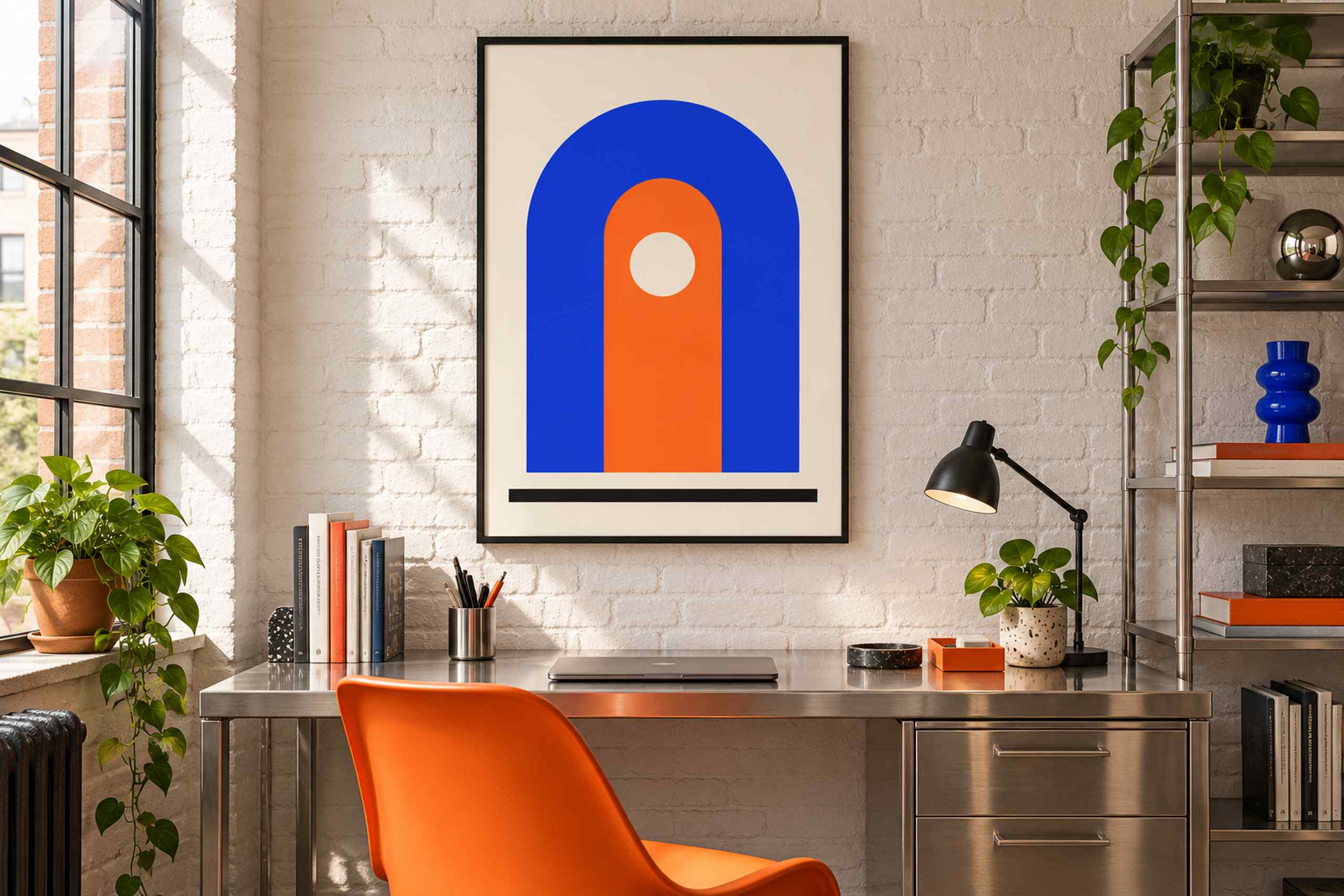
The room illustration places the poster above a brushed stainless steel desk against a white-painted brick wall. An orange molded chair faces the work surface, while a black adjustable lamp sits to the right. Open metal shelving carries books, a blue vase and trailing greenery. Daylight enters through the tall window on the left, picking up the irregular brick texture and the quieter reflections in the desk. Inside the frame, the blue arch rises around an orange column with a cream circular opening. The lower black line sits apart from the arch rather than joining it. That small gap gives the graphic a sense of suspension, despite its otherwise substantial shape.
The relationship between poster and furniture is deliberately straightforward. The orange chair answers the orange center of the print, while the blue vase provides a smaller echo of the arch. The desk contributes a neutral reflective surface instead of another colored block. I particularly like the contrast between its horizontal top and the poster’s upward curve. The two shapes give the office different directions, which is useful in a compact composition where every visible object can otherwise seem to line up in a row. You do not need an actual arched doorway nearby; the poster supplies its own architecture.
This collection is called Concrete Rhythm because it explores built forms and repetition, not because the print represents a specific concrete building. The first work uses flat fields of color rather than a photograph, simulated concrete grain or technical drawing. In the flat preview, the arch’s thickness and the cream circular opening are the main compositional decisions. The black baseline introduces a third visual weight. Those parts should remain intact when the design is placed in a room or fitted to a frame. Cropping the bottom line would remove the element that gives the arch something to push against.
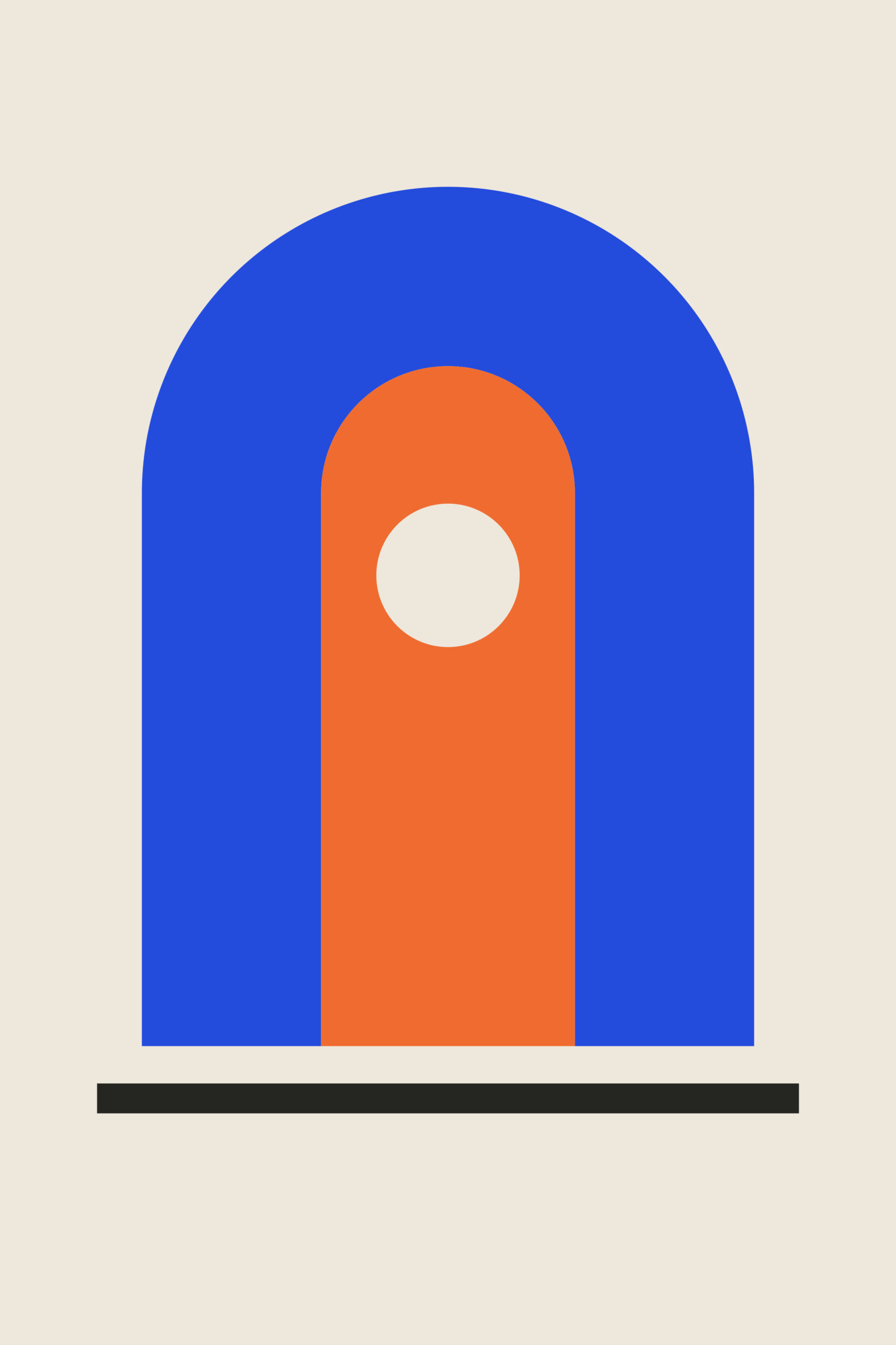
A useful planning exercise is to compare a 40 by 60 centimeter image with a 50 by 75 centimeter image, both retaining the master’s 2:3 ratio. These are proposed image sizes, not measurements of this illustrated office. The larger option may make more sense above a broad desk, but its external frame must also fit between the window, shelves and any wall fixtures. Measure those boundaries before deciding. A monitor changes the calculation as well. The illustrated desk has a closed laptop, so someone working with a tall external screen should test the frame position using the actual screen height. A lovely poster hidden behind a monitor is a fairly expensive secret.
I would start with a slim black frame because the artwork already contains a dark horizontal line and the room has a black lamp. Adding a wide black border would increase the visual mass considerably. A pale wood frame could soften the desk’s industrial character; brushed metal would extend it. Any mat should preserve the full image and be considered as part of the outside dimensions, rather than treated as invisible extra space. It is entirely possible for a modest print to acquire an unexpectedly large footprint once a generous mat is added.
There is no need to buy an orange chair to make this work. If your existing chair is charcoal, the orange can remain confined to the artwork and one small object, or simply to the artwork alone. Likewise, the blue vase is an optional echo, not a required accessory. The original motif is strong enough to establish a palette without demanding that the rest of the room join a uniform. For a more organic approach to similarly bold color, Paper Garden in a dining corner replaces architectural mass with loose leaf silhouettes. Concrete Rhythm keeps its feet on the baseline and lets the curve do the talking.