Tidal Studies Brings a Seaweed Cyanotype Look to a Bathroom Dry Wall
Blue and white can do a surprising amount of work on a small wall. Tidal Studies 01 uses that narrow palette for an intricate arrangement of seaweed-like forms, leaving the spaces between them as important as the fronds themselves. The poster has the appearance of a contact print: pale silhouettes against a deep blue field, with a little unevenness at their edges. In a bathroom, it offers an alternative to the familiar framed beach view. There is no horizon, boat or reassuring quotation about the sea. The interest is closer to hand.
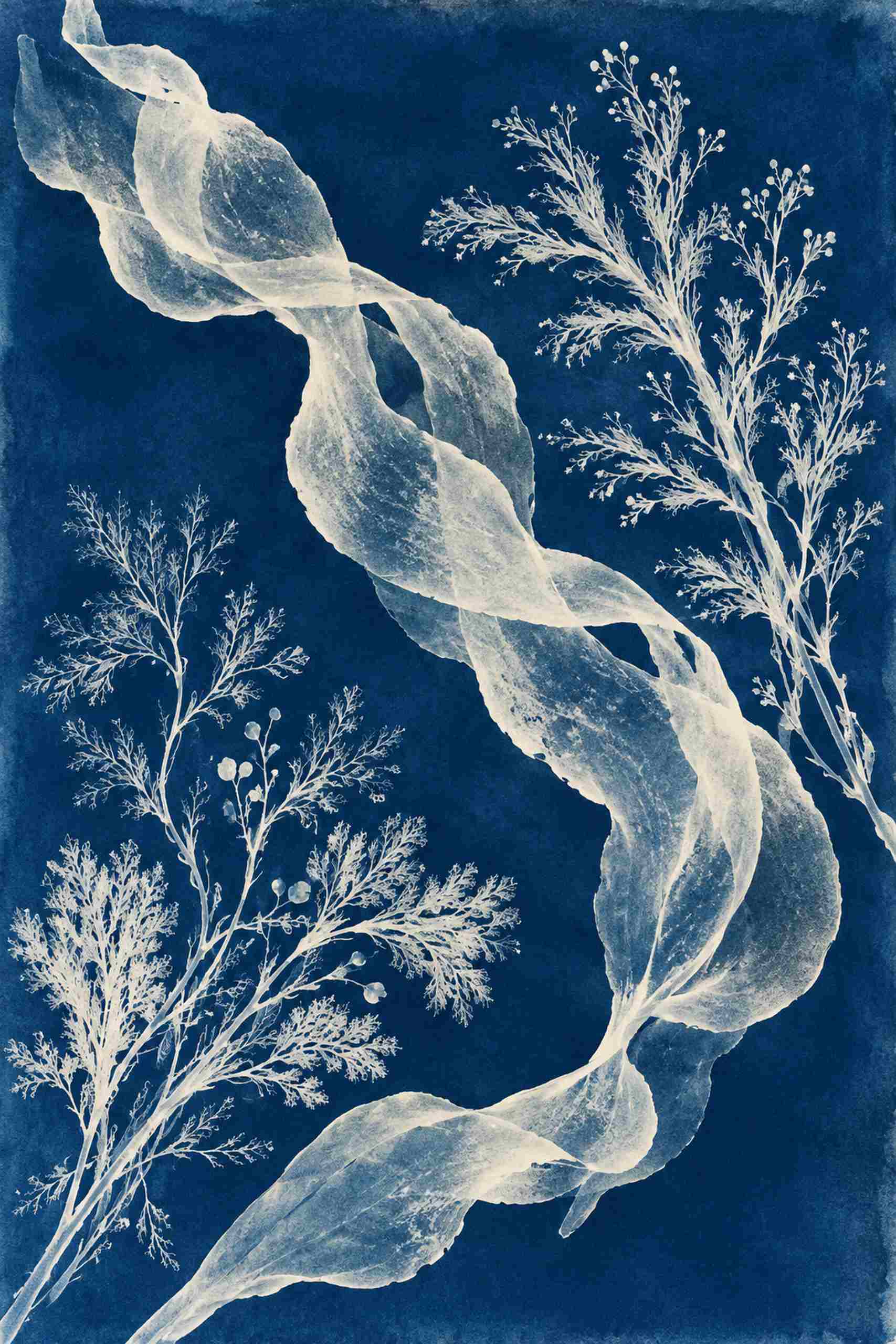
The flat artwork lets the different kinds of line separate. Fine branching forms spread outward like small fans, while a broader ribbon shape bends across the composition with more weight. Some pale areas look denser than others, suggesting overlaps rather than a single solid silhouette. Against them, the blue reads as a substantial field of color. It is not merely a background to fill around the botanical subject. This is an original cyanotype-inspired digital work, not a claim that a particular sheet of paper has been exposed or processed as a physical cyanotype. The marine forms are illustrative rather than a species-identification plate.
Our room concept puts that blue rectangle on a dry wall separate from the basin. Pale tiles and light oak furniture give it a quiet setting, while a blue towel provides a small connection to the print. The narrow white frame makes the boundary lighter than a black frame would. The result is more graphic than nautical. An ordinary bathroom can borrow this relationship without acquiring shells, rope details or another collection of things to dust. I would rather give one complicated picture a clear wall than ask a dozen small accessories to explain the same idea.
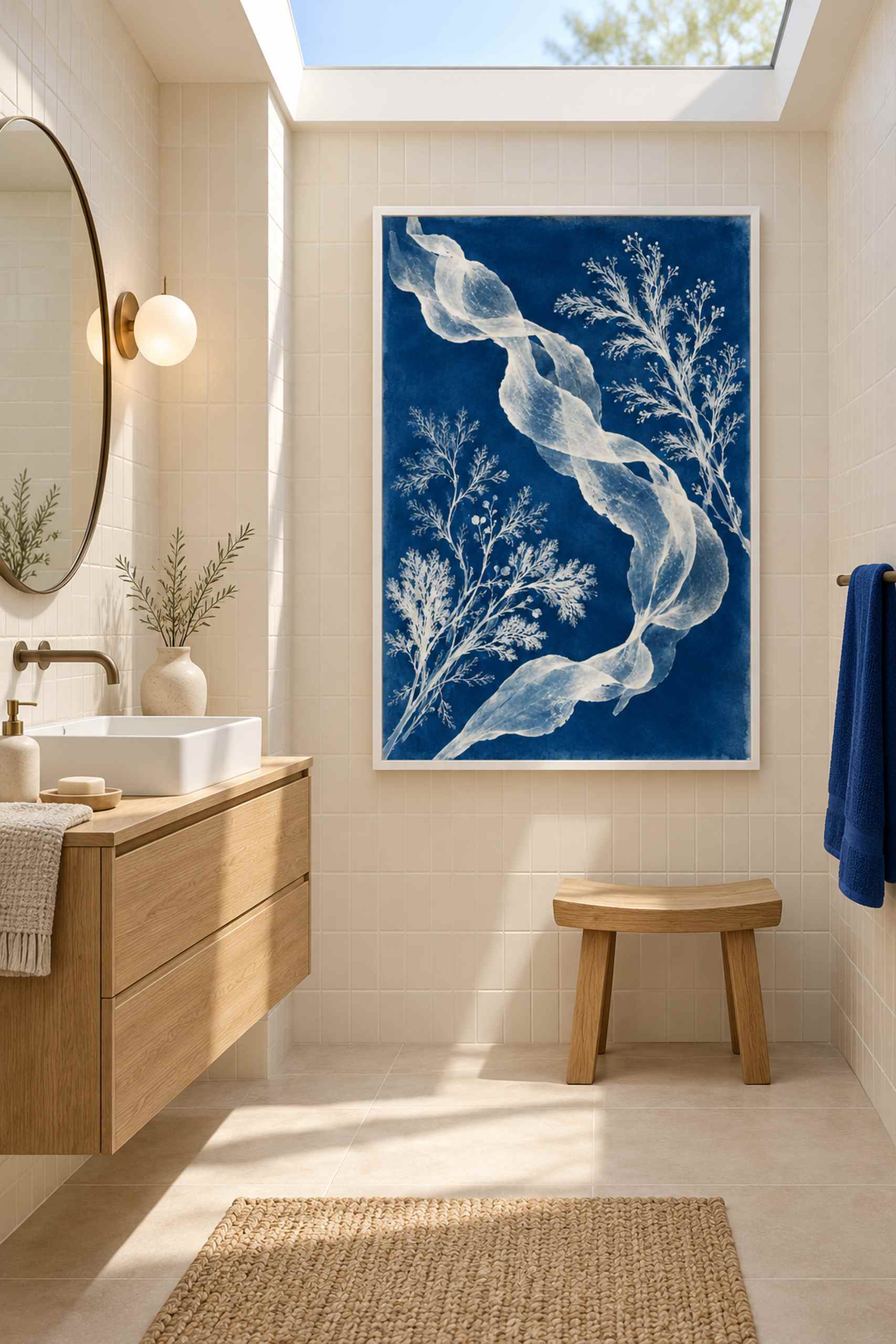
The practical distinction is between a wall that looks dry in a picture and a position that stays suitable through normal use. Check the actual distance from the basin and shower, how the room ventilates, and the specifications of the paper, frame, glazing and fixing system. The AI-generated room illustration cannot establish those conditions. It shows a proposed arrangement, not a tested installation. If the room becomes persistently damp or the intended wall receives splashes, a dry dressing area or the hallway just outside the bathroom may be a better place for a physical print. The blue-and-oak relationship survives that move quite happily.
For the composition itself, a lighter frame keeps attention on the pale plant forms. White is not the only option: a slim oak frame could connect directly to a vanity, while brushed metal could relate to fittings. The latter would give the blue a slightly cooler perimeter. I would compare actual frame samples beside the wall before adding a mat. A wide pale mat increases the outside footprint and makes the picture feel more separate from its surroundings; a narrow border keeps the deep blue field more immediate. Neither decision changes the artwork, but both change how much wall the arrangement asks for.
Try a paper template for a 30 by 45 centimeter image area first, then a 40 by 60 version if the dry wall is broad enough. Include the frame’s actual outer dimensions rather than treating its edges as free space. These are suggested planning sizes, not measurements taken from the generated interior. Look at the template from the doorway and from the position where you normally use the mirror. A picture can look neatly centered in an empty photograph and become awkward once the real towel rail, door and light switch are included. Those everyday interruptions belong in the test.
Tidal Studies begins a collection around marine shapes and blue-and-white contrast, with room for other arrangements later. It is a different botanical language from Paper Garden’s flowering branch, where red blossoms and dark ink provide the main rhythm. Here, detail gathers inside a restricted palette. The blue is allowed to be strong while the furniture stays plain. That seems a useful bargain for a room where useful surfaces should remain useful, and where a single clear image can carry much more personality than its size initially suggests.