Paper Cities Uses Folded Architecture to Brighten a Shared Studio Office
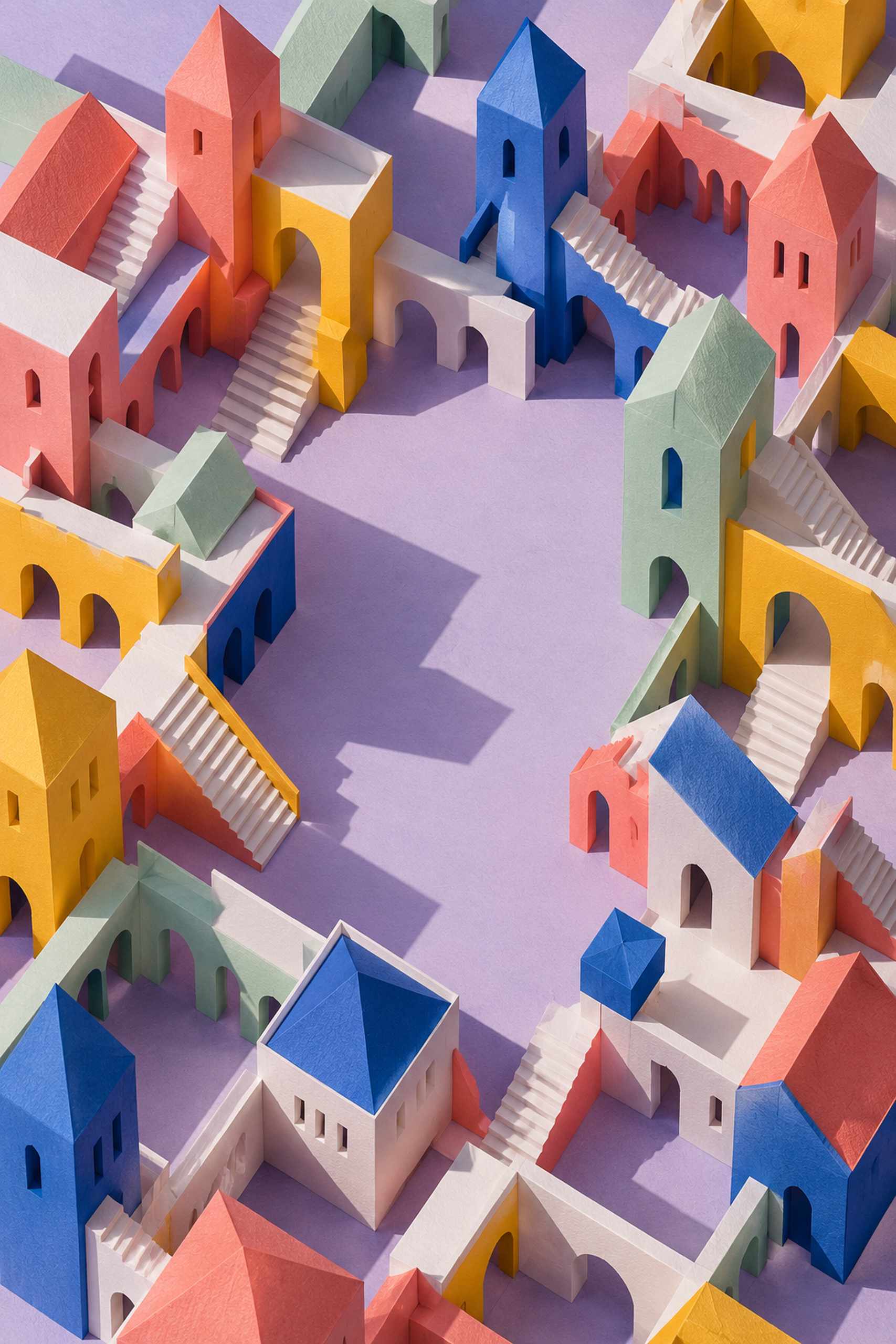
At first glance, Paper Cities 01 looks like a view of buildings. A second look reveals folded edges, colored planes and shadows that belong to paper rather than concrete. The little city is invented, assembled from angular towers, openings and stepped forms around a gap that could be a courtyard. It is architecture as a desk-sized experiment. That makes it a pleasing subject for a shared studio office, where a picture can suggest making things without becoming a chart about productivity.
The palette is deliberately broader than the pale walls around it: coral, mint, yellow, cobalt and lavender, with white planes catching the light. Shadows are part of the composition rather than incidental decoration. A folded face can turn a single piece of color into two quite different areas, one bright and one cool. The empty patch in the center prevents the structures from becoming a continuous pile. It gives the viewer somewhere to enter, even though the city is not a place anyone could actually visit. There are no labels or landmarks to decode.
In the studio illustration, two practical worktables and their screens occupy the working edges of the room. The artwork has its own wall above a low cabinet, where it can be seen between workstations rather than disappearing behind a monitor. A slim white frame relates to the wall, while a coral storage piece picks up a smaller part of the poster’s palette. Plywood surfaces and metal storage keep the room straightforward. The picture supplies the more elaborate structure. The desks are free to carry the actual day’s work instead of a carefully arranged model city.
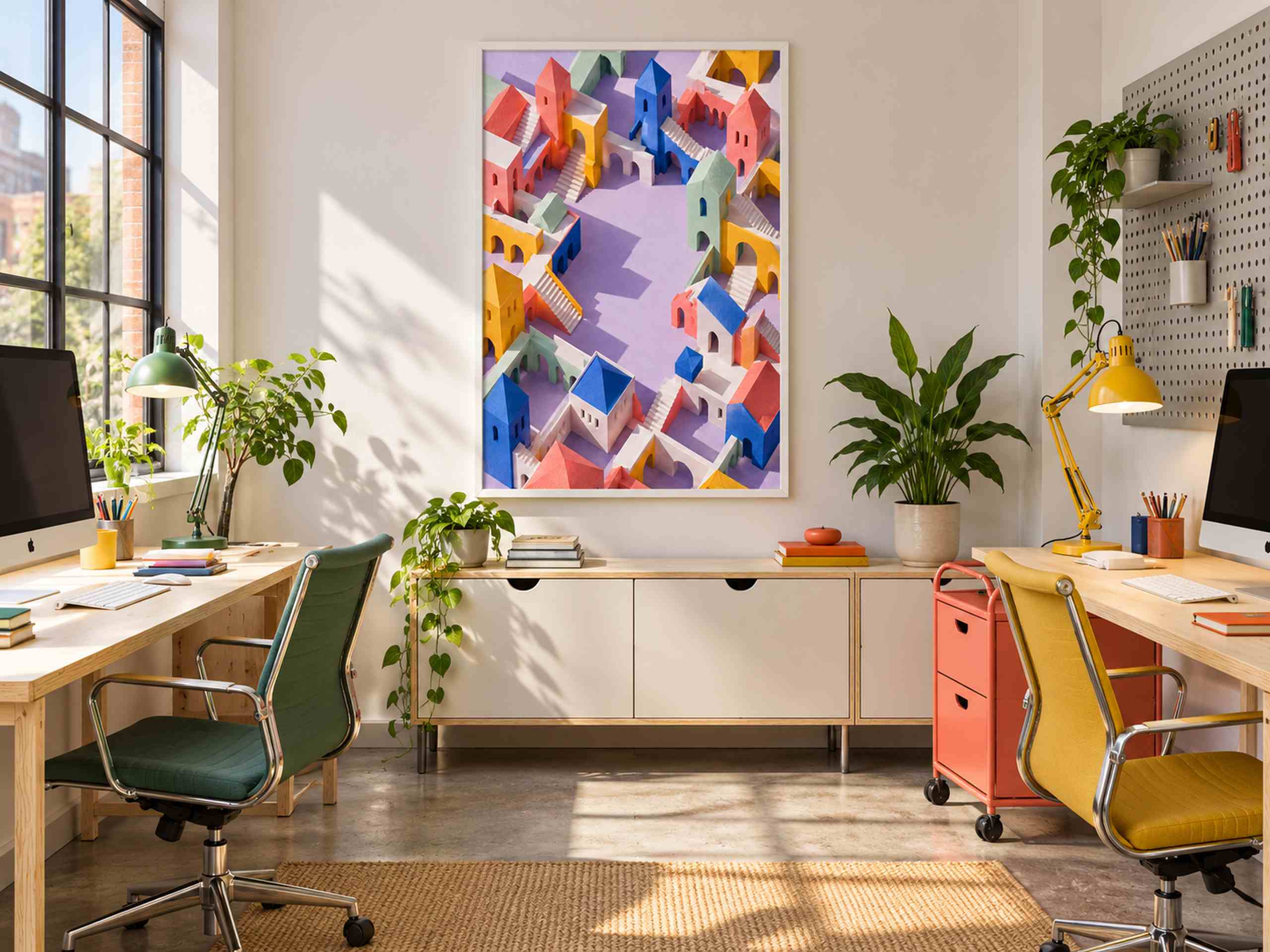
I like the distinction between an image about creative activity and a room pretending that creative activity never produces a cable. A shared studio needs somewhere for paper, equipment and the small items that migrate between desks. The wall print should not depend on those surfaces remaining empty. Put it where the normal monitor height, a standing person or a frequently opened cabinet door will not hide its main forms. The AI-generated concept suggests that relationship, but the actual equipment determines the usable sightlines. A low cabinet is helpful only if it remains the cabinet you need.
Paper Cities is a new collection, separate from the strong arches and bands of Concrete Rhythm. The distinction is material as much as subject. Here, the pleasure lies in the apparent folds, slight overlaps and directional shadows. It is an AI-assisted illustration of a paper construction, not a photograph of a model built by a named designer. That leaves room to enjoy its handmade-looking qualities without inventing a studio process or a physical object behind it. The original artwork remains the reference when it is shown in another setting.
Sizing matters particularly when a picture contains many small changes of plane. A tiny version may reduce them to a pattern, while a larger one makes the paper-like edges easier to notice. Start by comparing templates for 40 by 60 and 50 by 75 centimeter image areas, with the actual frame dimensions added. Those are proposed examples, not measurements read from the room illustration. Stand where each person normally enters and works. If one desk sees only the thin edge of the frame, enlarging it will not solve the angle. A more useful wall may be the one shared by both routes through the room.
The color connections do not have to become a furnishing brief. A studio with black chairs and plain storage can still carry the same image, letting the poster be the main cluster of color. If you do repeat a hue, choose the one already present in something useful, perhaps a rolling cart or file box, rather than buying a new object solely to match a small folded roof. The lavender ground is another helpful part of the design: it holds the busy forms together without needing a dark outline around every building. A whole imagined city can fit on this wall. It need not take over the rest of the office.