Tidal Studies Gives a Powder Room a Graphic Octopus
The octopus in Tidal Studies 02 gives a small wall a surprising amount of movement. Its dark arms curl through a pale peach field, with the spaces between them becoming part of the drawing. A small coral accent and cooler arcs introduce other rhythms without replacing the animal as the main form. It is a graphic interpretation, not an underwater scene full of background detail. That concentration makes it an interesting choice for a powder room, where a picture is often seen close up and the available wall may be modest.
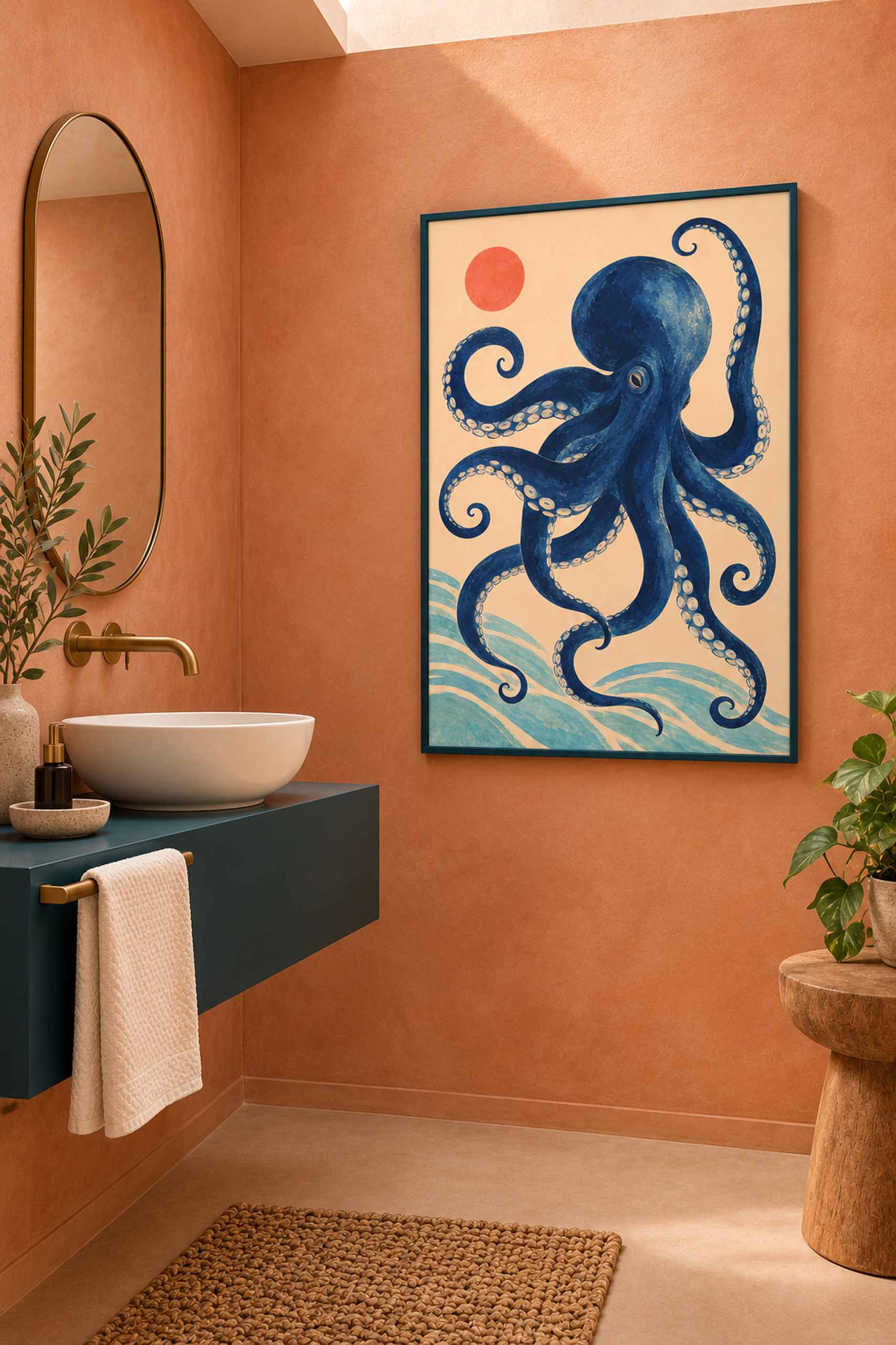
The room concept places the poster on a dry wall separate from the basin, with terracotta-peach surfaces around it and a darker vanity nearby. The frame picks up that deeper color rather than introducing a new metallic outline. A plain pale towel remains a useful object, while the artwork supplies most of the visual activity. The setting is intentionally contemporary. There are no shells, ropes or model boats, and the octopus is not asked to carry a whole nautical decorating scheme along with its own curling forms.
The flat preview shows why the light ground matters. It makes the arms legible as individual curves even where their directions cross or turn inward. Small pale marks within parts of the darker form introduce a different scale of detail. The coral circle is simpler and more concentrated, while the softer turquoise shapes at the lower edge have less visual weight. This is an original AI-assisted marine illustration. It is not presented as a scientific diagram, a species record or a photograph of an animal arranged for the composition. The design is free to simplify in order to stay readable.
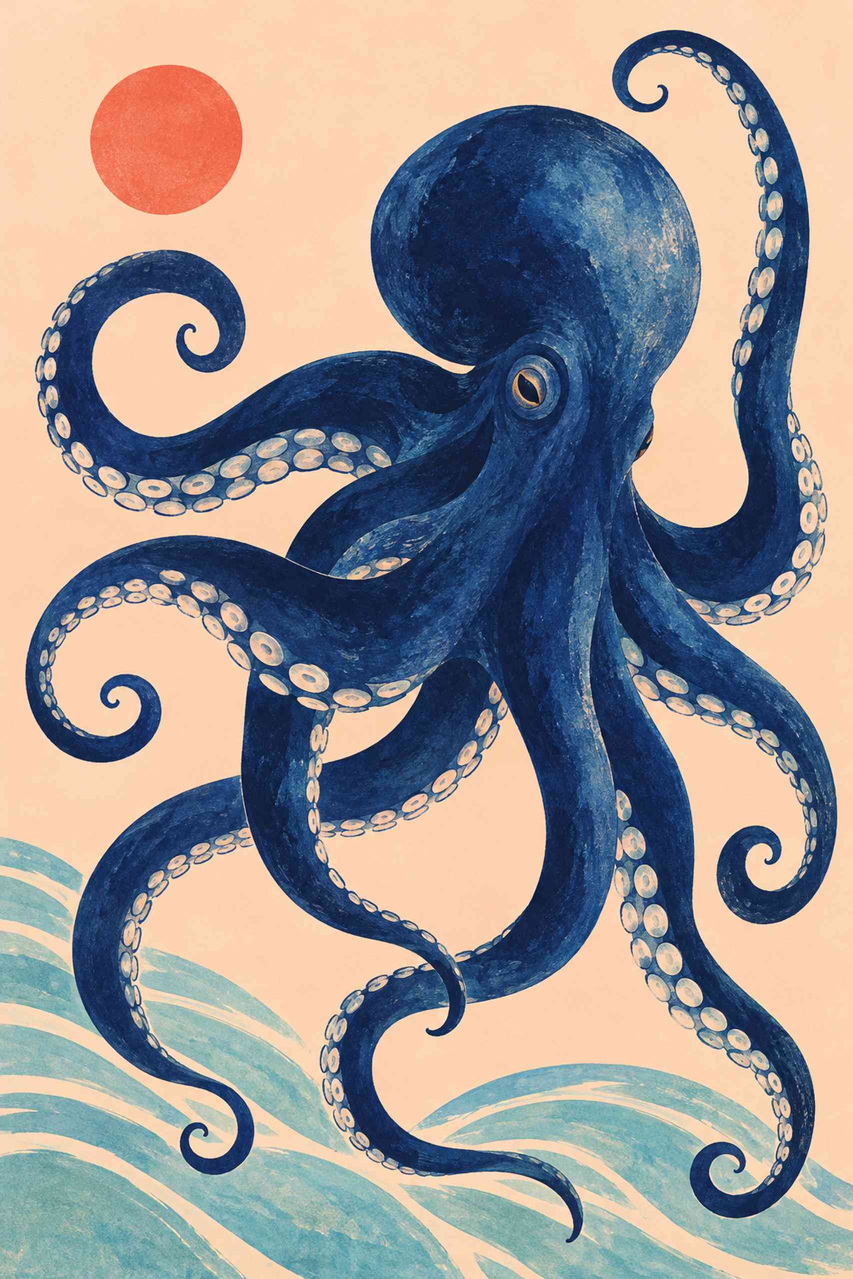
Tidal Studies began with blue-and-white seaweed imagery. The second work keeps the interest in flowing marine forms but changes the relationship between figure and ground. Instead of pale silhouettes within a large dark blue field, the animal carries the deeper color and the surrounding paper-like area becomes lighter. That reversal is worth exploring in a small room. A pale rectangle can keep its graphic clarity against a warmer wall without needing a broad white mat around every edge. The design’s open spaces already supply some separation of their own.
The dark frame in the concept connects with the vanity and gives the pale field a defined perimeter. A narrow white frame would make a lighter object on the wall, while brushed metal might link the picture more directly to fittings. I would test those choices beside the actual wall finish. A textured peach surface can make the pale image look different from the same print against smooth white paint, even when the artwork has not changed. The frame is a way to manage that boundary, not an independent decorative object that needs to attract attention first.
Practical placement comes before choosing the final outside dimensions. Check which wall stays suitable through normal use, including splashes from the basin and the room’s actual ventilation. The AI-generated illustration does not establish those conditions or certify any paper, glazing or frame against moisture. A dry wall or a separate dressing area is the useful starting point for the idea. Make a paper template of the intended full frame size, then look from the entrance and the normal standing positions. The basin, mirror, light and towel rail should remain easy to use without negotiating around the picture.
A physical sample under the existing light will say more about the eventual indigo and peach than the screen image can. I would keep the other accessories simple and let the darker animal form provide the complexity. The work does not require a story about the ocean’s effect on wellbeing to justify itself. It offers something more direct: a legible, expressive arrangement of curves in a compact space. A powder room can have a little visual eccentricity while still being an ordinary useful room. In this case, the eccentricity happens to have a very good silhouette.