Paper Garden Carries Orange Lily Color Into a Narrow Hallway
The end of a narrow hallway can feel visually farther away than it actually is. A strong picture gives the eye somewhere definite to land, which is useful when the surrounding surfaces are mostly doors, pale walls and necessary storage. Paper Garden 03 supplies that destination through an orange bloom against deep blue. The flower is large inside its composition, so it remains readable before you are standing close to the frame. It does not need a wider hallway to make its point.
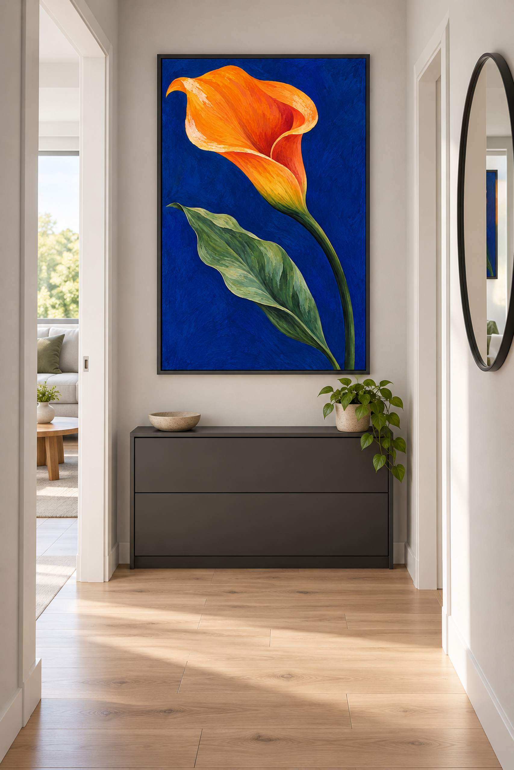
The room concept keeps the route simple. A shallow closed cabinet sits against the wall, the frame occupies the space above it, and a mirror belongs to a perpendicular surface rather than sharing the same wall as another competing rectangle. Pale wood underfoot and light grey around the picture leave the orange and blue as the main color event. There are no added floor vases or decorative stools narrowing the passage. The cabinet provides a practical base for the arrangement, but the artwork can remain a wall decision rather than an excuse to bring in another piece of furniture.
This is the exact orange lily introduced in the small gallery. The curled petal, green stem and broad leaf have not been rearranged to suit the hallway. Their relationship with the setting is what changes. In the gallery, the image had more empty wall around it and a bench below. Here, it participates in a shorter view with the usual interruptions of an apartment entrance. Reusing the same design makes that comparison worthwhile. A new flower under the same number would obscure whether the room or the artwork was responsible for the difference.

The blue field is particularly useful at the end of a pale passage because it gives the frame a clear interior boundary. The orange bloom can then register within that blue rather than having to compete directly with every nearby wall edge. The green stem leads downward through the portrait composition, while the leaf gives the lower half enough weight to balance the flower. I would preserve the whole image. Cropping away some of the lower stem simply to fit a convenient frame would change the relationship that makes it readable from a distance.
Before deciding on size, look along the hallway from the positions where it is normally entered. A 30 by 45 centimeter image area is one possible starting point above a shallow cabinet; include the actual frame dimensions when testing it. These are proposed measurements, not dimensions taken from the generated room. A larger version may be more legible at the far end, but it should remain comfortable beside door frames, switches and the things people carry through the passage. The strongest arrangement is the one that makes use of the available wall without asking the hallway to stop being a hallway.
The charcoal frame connects with the cabinet and gives the picture a firm edge against the light wall. A slim wood frame could relate more to the floor, while a pale border would make the surrounding rectangle feel lighter. The mirror should be considered from the usual approach too. Its reflection can introduce another view of the image or a bright window, depending on the actual layout. The AI-generated concept proposes one relationship; it does not test the angles of an existing apartment. A paper template and a look from each doorway are more useful than judging the arrangement only from straight in front.
A physical sample is still needed to judge printed blue, orange and glazing under the hall’s light. The room illustration and web preview are not a print proof. What travels from the gallery to this smaller setting is the artwork’s directness: one substantial flower, one dark color field and a clear route through the stem and leaf. I would leave the surrounding surfaces fairly plain and avoid adding orange accessories just to keep the bloom company. The passage already has plenty to manage. The picture can provide the one thing it may be missing, a view worth walking toward.