Tidal Studies Pairs Deep Blue Seaweed With Warm Office Wood
A cool-colored picture does not require a cool-colored room. Tidal Studies 01 makes that point particularly well beside warm wood. Its dense blue field and pale marine forms introduce a different visual temperature from a walnut desk, but the difference gives both materials more presence. The office does not need blue furniture to make sense of the print. Nor does the print need a collection of seaside accessories to explain why it belongs there. This version begins with an ordinary working room and lets one image change its balance.
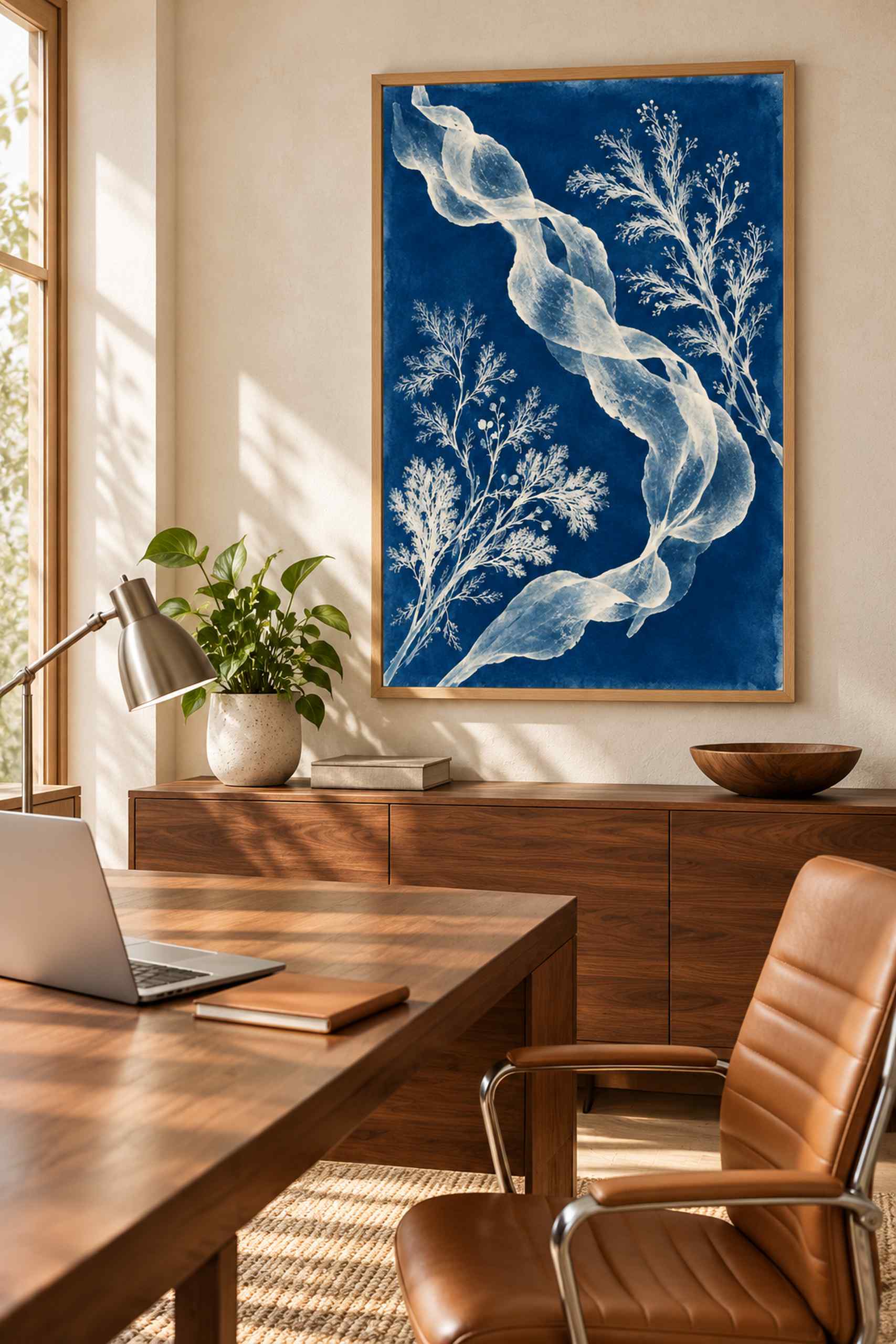
The office concept places the seaweed artwork above a low wood cabinet beside the desk. Walnut grain supplies a broad warm surface below the framed blue field, while the cream wall gives the arrangement some breathing room. A tan chair, a small lamp and a restrained working surface keep the room useful. The picture is visible from the approach to the desk rather than hidden behind a screen. That position matters more to the composition than owning the exact desk in the illustration. A strong color relationship is little use if the artwork spends most of the day behind equipment.
This is the same Tidal Studies 01 introduced on a bathroom dry wall, not a new seaweed arrangement disguised under the old number. The pale ribbon form still bends across the deep blue, with finer branching silhouettes gathering around it. In the bathroom setting, the light tiles and white frame emphasized the blue-and-white contrast. Here, the surrounding wood makes the image feel more distinctly cool. Showing the work in both contexts is useful because a poster is rarely judged in isolation once it reaches a real room. Its neighbors become part of the experience.
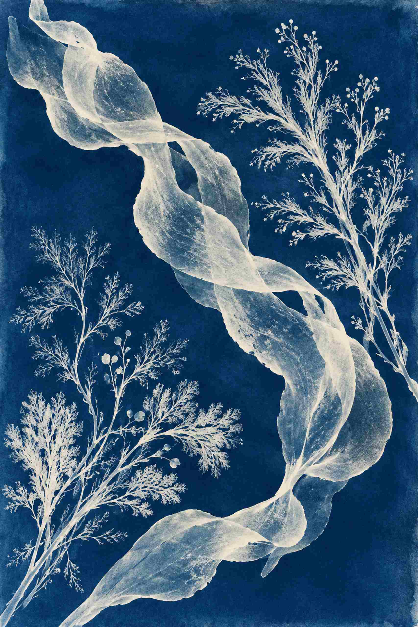
The frame provides a small but consequential decision. Natural wood can connect the picture to the cabinet without trying to match its grain or finish exactly. A white frame would give the blue a lighter boundary, while black would make the poster more self-contained. I would compare those relationships on the wall before choosing a generous mat. The image already includes plenty of intricate pale edges against dark blue. A broad extra border might make it feel more like an object under examination; a narrow frame leaves the forms more immediate. Either can work, but they are different ways of introducing the same print.
The room’s warm materials also make it possible to leave the rest of the palette alone. There is no requirement for a cobalt notebook, blue chair and matching desk tray. If one existing object happens to pick up the image, that can be enough. The pale seaweed forms may have a quieter relationship with a cream wall or light paper on the desk, and the darker stems of everyday objects can sit comfortably beside the blue. I would start by removing unnecessary matching accessories from the proposed scheme, then see whether the print still feels connected. Usually the wood-and-blue contrast is doing more than those accessories would.
At the desk, test the normal view rather than the view you get by standing against the opposite corner with everything tidied away. An open laptop, external monitor or raised lamp changes what is visible. A paper template of the actual outside frame size is a straightforward way to test the available wall before ordering anything. Check it while seated, on entering the room and with cabinet doors open where relevant. The AI-generated office is a visual proposal, not a measured plan of your equipment. The arrangement should accommodate the working day, including the objects that remain on the desk after the photograph would normally have been taken.
Tidal Studies is cyanotype-inspired in appearance; this digital design is not presented as a chemically produced physical print. Its web preview is also not a paper or color proof. A sample under the office’s actual daylight and evening lamp will say more about the eventual blue than the room illustration can. What the illustration does establish is an appealing direction to test: a complex cool image above warm, comparatively plain furniture. The room keeps its ordinary tasks. The picture adds a different kind of detail, one that can stay interesting without becoming another thing that needs organizing.