A Kitchen Poster Does Not Have to Show Food
A kitchen already contains plenty of food imagery, even when nobody has hung a picture. Fruit sits on the counter, packets crowd a shelf, a cookbook is open beside the hob, and the refrigerator collects its own small exhibition. The wall can offer a different view. Night Windows 02, an invented harbor at dusk, brings water, distant windows and a broad evening sky into that practical setting without turning another surface into a menu.
The poster has a strong lower foreground. A pale working boat sits beside a dark stone quay, its cabin and ropes outlined against teal water. A coral buoy floats near the bottom edge. Across the harbor, warm windows and lamps cast broken orange reflections, while the buildings gather beneath large lavender clouds. The sky holds peach and amber near the horizon, becoming cooler higher up. There is plenty happening in the picture, yet the open water gives the eye a route through it.
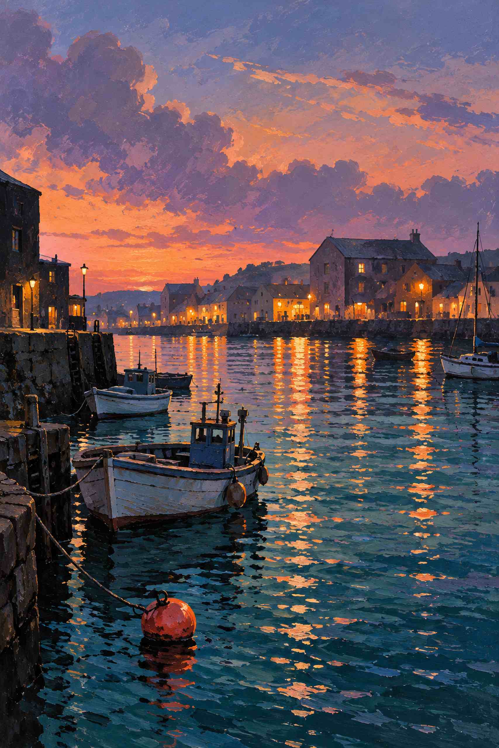
For a kitchen, that combination supplies useful choices. The blue-green water could relate to painted cabinets, while the warm reflections could sit comfortably beside pale wood or a small copper-colored object. You do not need all of those relationships at once. With strong cabinet color already present, let the wall picture repeat one note and introduce another. With white cabinetry and steel surfaces, the poster can provide most of the color by itself.
Think about where the picture will actually be seen. A wall beside a breakfast table offers a different viewing distance from a narrow strip above a preparation counter. The harbor’s small windows and boats reward a close look, but its larger structure still needs to read from the doorway. Test the proposed frame size with paper before ordering anything. The paper outline reveals whether a tall image fits the wall, clears the furniture visually and leaves enough space around switches or other fittings.
An appropriate location matters more than forcing a picture into the most obvious empty rectangle. Avoid exposing paper art to direct splashes, grease or persistent steam. A dry dining end of the kitchen may be a more practical choice than the wall immediately behind a kettle or hob. Frame and glazing choices should suit the actual conditions and the supplier’s care guidance; no frame makes an ordinary paper print universally resistant to heat and moisture. If the room offers no suitable place, another room may be the better home for it.
Glare can change the decision too. A dark part of the quay may disappear beneath a bright window reflection in the glazing. Look at the intended wall from a seated position and from the entrance, both in daylight and under the lighting used after dinner. Samples of glazing are useful when available. Moving a frame slightly can sometimes improve the view more than choosing a different picture, although the wall still needs safe, appropriate fixing.
The subject also affects how the kitchen feels to use. A harbor creates a small visual departure from the immediate work of cooking and clearing up. That is a personal reading rather than a promise about mood. Someone who enjoys preparing food may prefer a bold still life; someone who works at the kitchen table might welcome a view that has nothing to do with the next meal. The room’s function does not prescribe the picture’s subject.
Night Windows 02 was first considered above a living-room sofa. Moving the same work into a kitchen changes the design question from the width of a seating group to the balance between cabinets, equipment and a smaller dry wall. The artwork itself remains unchanged. This is a proposed application, with no room mockup or completed installation implied.
Before printing, separate the website preview from the production decision. Check the intended proportions, available source resolution, paper and color handling with the print supplier, and proof the deep water and warm highlights. Those areas carry much of the picture’s contrast. A kitchen poster can show boats, leaves, architecture or a large abstract shape. Start with the wall and the image you want to live with; the groceries can supply their own illustrations.