Market in Motion Turns a Crowded Bazaar Into Bold Abstract Art
There is barely an empty inch in this picture, and that is the point. Market in Motion begins with a photograph of a crowded market passage, then turns its overlapping people, makeshift canopy and crowded stalls into a dense arrangement of color. The source photograph already contains the composition: a river of heads below, sharp diagonals above, and a bright opening pulling the eye toward the back. Posterization gives those relationships more force. You can still recognize the market immediately, but your eye starts following the shapes before it starts identifying the merchandise.
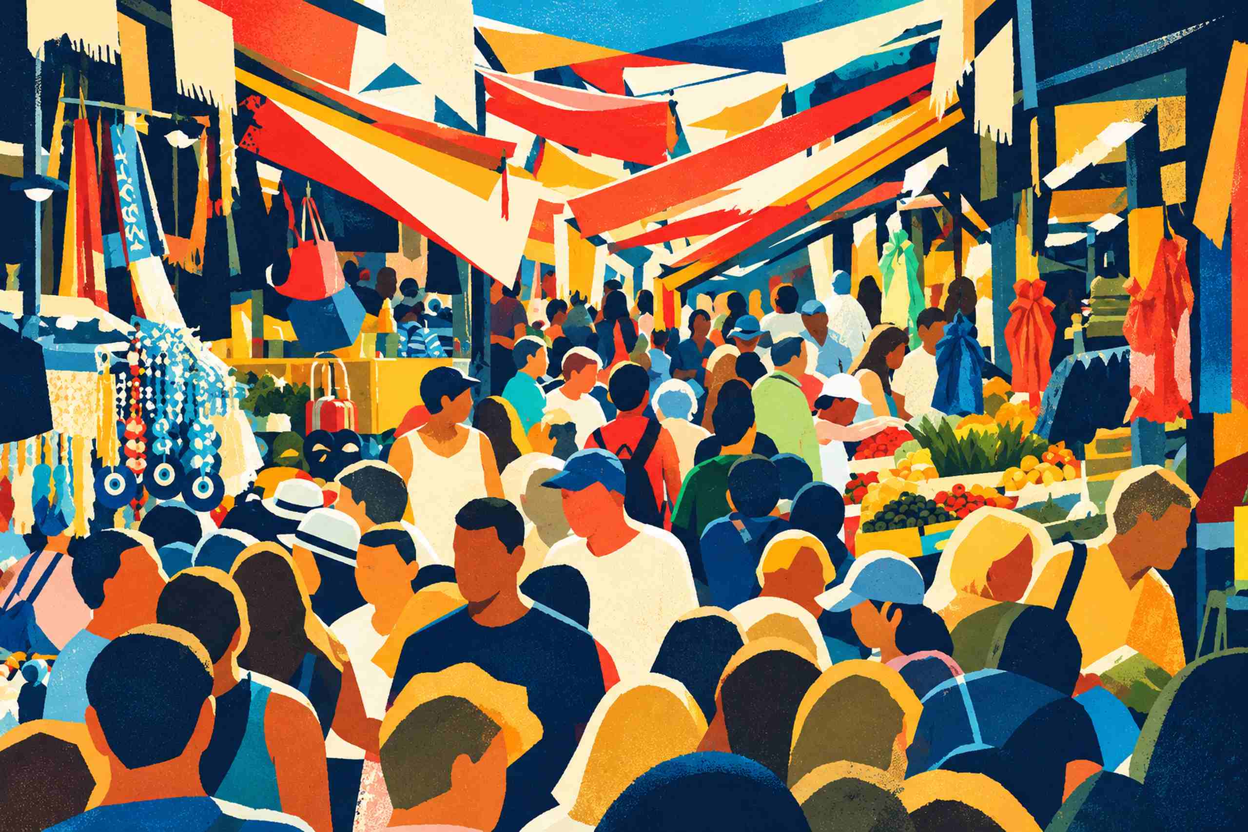
Across the top, vermilion, golden yellow and warm ivory awnings cut through deep blue shadows in long, irregular wedges. Their edges cross and overlap rather than settling into a tidy stripe pattern. A turquoise patch opens a little breathing space near the upper center, while the surrounding navy gives the bright fabric its weight. Below, the crowd becomes a sequence of rounded heads, pale hats, cropped shoulders and blocks of clothing. The large foreground figures establish a strong lower edge; smaller figures farther along the passage keep the scene moving inward. It is busy, certainly, but the changes in scale stop the crowd from becoming a flat decorative pattern.
The stalls retain just enough detail to explain what kind of place this is. On the left, hanging blue-and-white circular ornaments and strings of small shapes create a glittering vertical interruption. On the right, little red, yellow and green clusters suggest produce piled across pale counters, with hanging red fabric above. Those small marks matter because they sit between the big awning shapes and the human silhouettes. Take them all away and the image would lose its particular market character. Keep every photographic detail and the graphic clarity would disappear. This version lives in that useful middle ground.
The faces have been simplified into mostly unarticulated planes, so the crowd reads as collective movement. A white hat, a blue cap or a red shirt is enough to separate one figure from the next. There is also a fine mottled texture across the color fields, giving the artwork a screenprint-like surface. That describes its appearance, rather than a claim about a physical printing process. The image is an AI-assisted reinterpretation of a photograph, with details reworked during that transformation. Its appeal lies in the retained spatial rhythm and the stronger color structure.
I like this kind of image near a dining table because its subject has a natural connection to ordinary social life: shopping, food, conversations and people getting in one another’s way. It does not need a room full of market souvenirs. In fact, comparatively plain furniture gives the dense picture more room to operate. A low walnut sideboard brings a broad, quiet horizontal surface beneath the angled canopy, while a narrow black frame continues the darker outlines without competing with the artwork. An ivory wall lets the pale areas of the image remain visible as shapes.
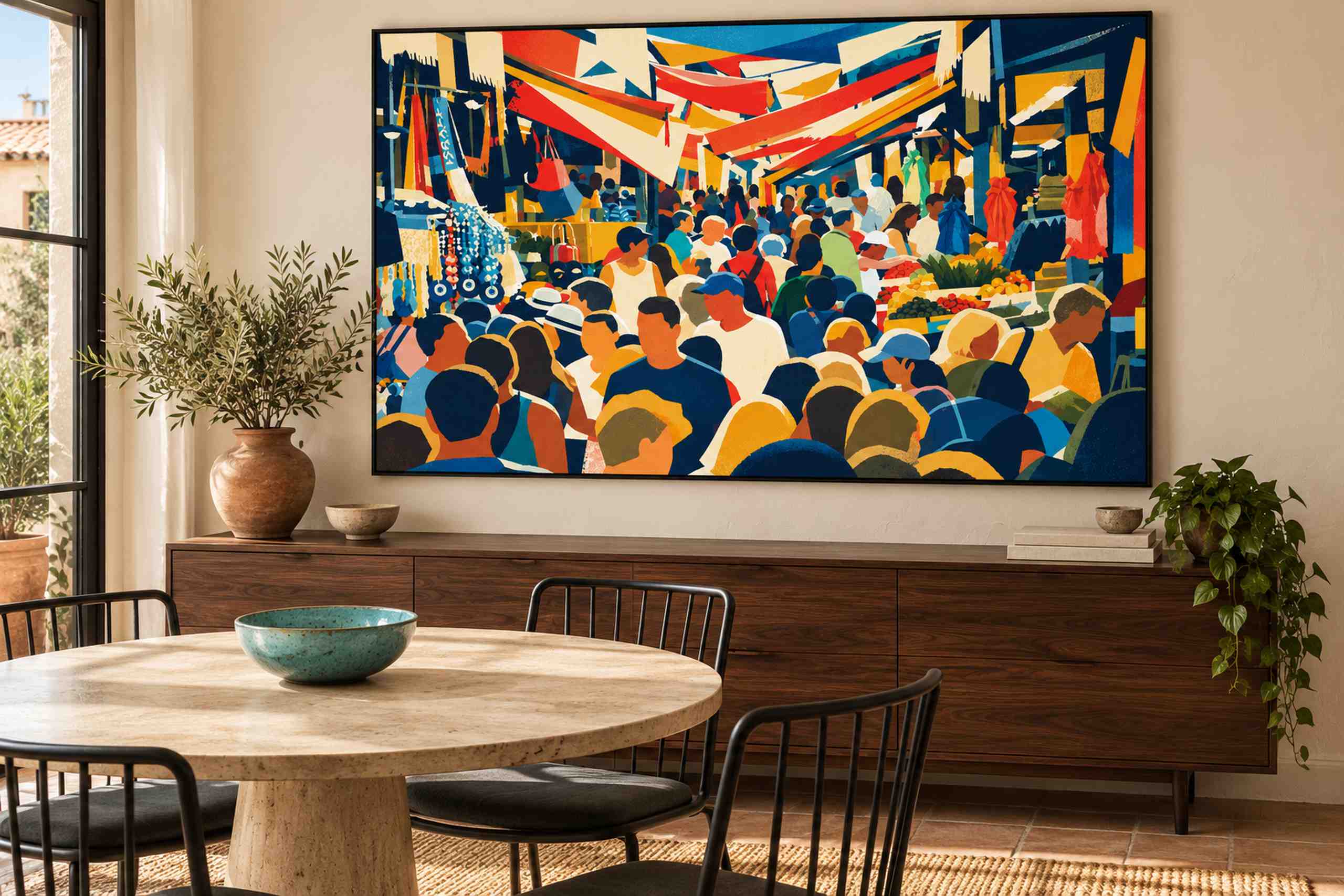
The room concept makes that relationship visible. The framed artwork occupies much of the wall above the dark timber cabinet, while a pale round table and slender black chairs leave the foreground relatively open. Daylight enters through a black-framed window at the left. A turquoise bowl makes one modest connection to the image, and plants soften the cabinet’s ends. The arrangement already has enough color. I would resist adding red cushions, yellow plates and blue lamps simply because all three appear in the poster. A single echo is often plenty; the market can supply the rest.
Scale changes how this artwork reads. From across a room, the awnings and dark foreground silhouettes should still form a clear structure. At closer range, the stalls and little gaps between figures become the reward. As an illustrative planning example, a 90 by 60 centimeter image above a 150 centimeter sideboard would leave roughly 30 centimeters on each side before allowing for the frame. Those are proposed dimensions, not measurements inferred from the generated room. A paper rectangle taped to the actual wall is a useful way to judge the overall footprint from both the table and the doorway.
For a quieter urban mood, Night Windows takes city imagery toward reflected light and atmosphere. Market in Motion heads into the crowd instead. Its tightly packed composition gives a relatively simple room something substantial to look at, without needing several smaller pictures around it. The web image is an editorial preview, with no print edition or production size implied. What it establishes is the design itself: a recognizable everyday scene, reorganized into bold color, with a little of the market’s glorious congestion left intact.