One Photograph Three Completely Different Posters
The same arch can become a warm landscape, a loud piece of color geometry or a sharply drawn monochrome scene. This comparison starts with the photo-derived Stone and Distance 02 artwork, Summer Among the Ruins, and develops two companion interpretations from it. The subject stays recognizable across the three treatments: two visitors sit above a broad stone arch, a third leans beside the broken wall, a leafy tree fills the left edge, and a wooded slope closes the distance.
Keeping those relationships gives the experiment a useful control. The arch supplies the main curve, the wall provides vertical weight, and the people establish scale. Changing the palette then changes which relationships arrive first. These are editorial web previews of distinct interpretations, with small differences in marks and contours. They are not a demonstration of three mechanically identical color separations, and no print edition or physical proof is being offered here.

The warm version gives the masonry the largest range of color. Honey yellow, cream and ochre sit beside slate-blue shadows, with small green plants breaking the edges of the stone. The tree is dark and dense, while the hillside falls into softer blue-green patches. You can move from the broad curve toward individual blocks without leaving the image’s visual language. It feels like a landscape that rewards a closer look, making it a plausible choice where the wall is seen both from across a room and from a nearby chair.

In the second treatment, blue spreads across the hillside, foliage and clothing, while red cuts through the stone and leaf tips. Ivory becomes an active part of the composition rather than a neutral margin. The arch reads immediately, almost like a large sign within the landscape, and the diagonal hillside acquires a stronger rhythm. The figures remain small, yet the red and ivory stripes around the seated visitor pull the eye toward them. There is less quiet color between the large shapes, so the picture asks more of the room around it.
That stronger version could work beside plain white storage, a steel table or a dark cabinet, where its red and blue have enough space to register. Matching every accessory to both colors would make the arrangement busy. Choose one relationship to carry outward: perhaps a small blue object elsewhere in the room, or a warm red textile some distance from the frame. These are proposed uses, of course; the artwork preview does not establish the size or light conditions of an actual installation.
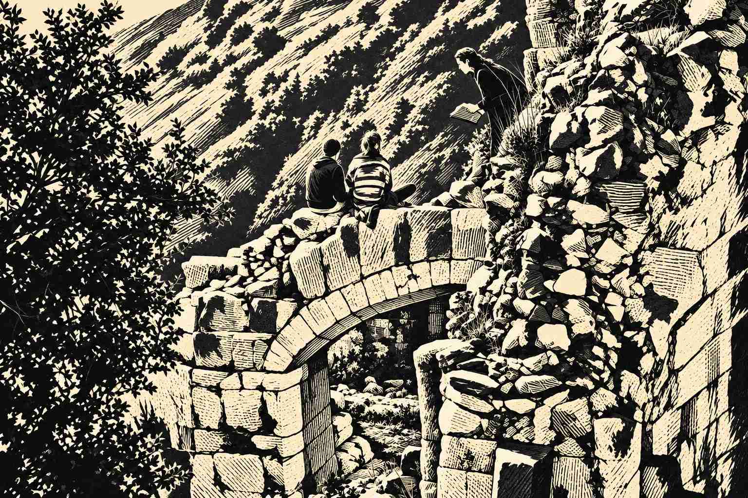
The monochrome treatment removes the warm-versus-cool color relationship and replaces it with a network of dark masses and fine marks. Black foliage crowds the left side; pale stone blocks advance from the much darker joints; parallel hatching carries the slope diagonally behind the visitors. The seated pair become particularly clear silhouettes, while the leaning figure connects visually with the broken wall. The surface has a linocut-like appearance, though this is a digital illustration rather than a claim about a physical printing process.
A black frame would connect with those dark areas, while a pale mount could give the busy edges more breathing room. In a kitchen or dining space with strong cabinet colors, this version offers a way to use the same subject without adding another large color statement. It is still detailed, and that detail needs a realistic proof at the intended size. A monochrome image can be visually dense even when its palette sounds restrained.
Compare the three at a similar displayed size, then ask which part you remember after looking away. The warm treatment favors sunlit stone and landscape depth. The cobalt-and-vermilion treatment favors large color boundaries. The black-and-ivory treatment favors the arch, silhouettes and patterned surface. None replaces the others as the correct reading of the source. Choosing among them is a decision about what you want that particular wall to hold.
The earlier Summer Among the Ruins article explores the original warm interpretation in more detail. This comparison adds two routes away from it while keeping the scene’s essential structure. The web files differ in resolution, so a final print would need its own preparation and proofing. Begin with the relationship between the picture and the room, then settle the production file. It is easier to make that choice when you can see how differently one scene can speak.