Stone Arch in Ochre and Blue
The people are almost an afterthought, until you imagine the picture without them. Across the upper edge of Stone Arch in Ochre and Blue, visitors pause beside a railing, look into the distance and raise a phone. Their small silhouettes turn an impressive shape into an enormous one. Beneath their feet, the rock sweeps across the image in a broad orange arch, framing a wooded valley that drops away into turquoise and blue. This poster begins with the supplied photograph and keeps that compelling relationship between ordinary human activity and extraordinary scale.
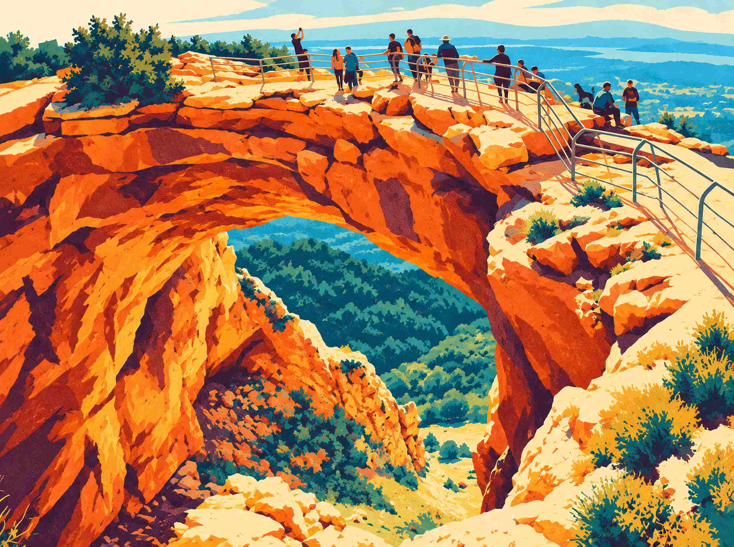
The limestone dominates the composition. On the left, a steep face climbs out of the bottom corner in long, broken planes of ochre, terracotta and bright orange. Dark plum wedges cut between those planes, while pale yellow highlights pick out the upper ledges. The rock bends overhead into a thick span before descending on the right as a narrower, shadowed support. Its outline remains irregular enough to feel eroded and weathered. Posterization simplifies the surface into distinct color areas, but it leaves the arch with weight. You can follow its curve almost as a single gesture, then return to the smaller fractures within it.
Through the opening, the temperature of the picture changes. Dense clusters of dark teal trees fill the valley, broken by olive and turquoise patches that become progressively lighter toward the distance. The cool colors make the orange rock seem closer and more exposed to the sun. At the bottom of the opening, a pale strip of ground interrupts the forest and draws the eye downward. Above the ridge, the horizon stretches into broad blue bands beneath a warm cream sky. There is room to breathe up there, which matters in a picture with so much rock pressing toward the foreground.
The railing is a useful complication. Its thin, angular lines cross the uneven ridge and descend diagonally along the right edge, setting a human geometry against the rock’s much less cooperative contours. Removing it might produce a more timeless landscape, but also a less particular one. Here, the railing introduces an everyday route through the scene. You can mentally walk along it. The figures reinforce that route: a raised arm near the left, paired visitors toward the center, a pale hat, then a small group farther right. They are simplified marks rather than portraits, yet their pauses and gestures keep the landscape inhabited.
This is an AI-assisted interpretation of a photograph, with shapes and details reworked during the transformation. The granular surface suggests a printed illustration, without implying that a physical screenprint exists. The artwork also avoids the usual travel-poster lettering. There is no destination name across the sky and no slogan underneath the arch. That choice gives the geological form the whole frame. Even at a quick glance, the main event is clear: a huge warm curve surrounding a deep pocket of cool color.
For a living room, I would treat the orange as the dominant accent and let the rest of the room stay comparatively calm. A charcoal sofa, a pale wall and a simple timber cabinet could support this picture without copying its palette everywhere. One blue ceramic bowl or a muted green textile would make a sufficient connection to the valley. There is already plenty happening within the image; it does not need a companion collection of orange objects. A slim dark frame would pick up the plum shadows and the railings, giving the bright stone a firm outer edge.
The landscape format suits a horizontal wall space where the arch can remain intact. Cropping it into a tall opening would sacrifice the relationship between the massive left rock face and the descending path on the right. When planning a placement above furniture, begin with a paper rectangle in the same proportions and look at it from the doorway as well as the seat opposite. The distant blue bands should still register from across the room, while the visitors become something to discover closer up. No physical print size is established by this web preview; a production file would need separate preparation and proofing.
There is a useful connection with Concrete Rhythm, which also makes an arch and warm-cool contrast do much of the compositional work. Here, though, the curve is rougher and the scene refuses complete geometric order. Bushes crowd the upper left, little ledges break the sunlit right slope, and the visitors arrange themselves with the casual untidiness of a real outing. I would keep that untidiness. It gives the bold color something worth describing, and makes the arch feel like a place people have actually stopped to look.