Brussels in Vintage Travel Colors
Brussels arrives here in warm cream and weathered teal, with just enough terracotta to keep the square moving. This travel poster takes a busy view of Grand Place and gives it the color economy of a vintage printed illustration: sunlit buildings become broad fields of ivory and honey ochre, windows settle into dark blue recesses, and the sky loses its photographic brightness in favor of a quieter turquoise. The scene remains crowded, wonderfully so. People cross in front of the architecture, bags swing from shoulders, and someone raises a camera toward the buildings. It feels like a place encountered on foot, with the next few steps still undecided.
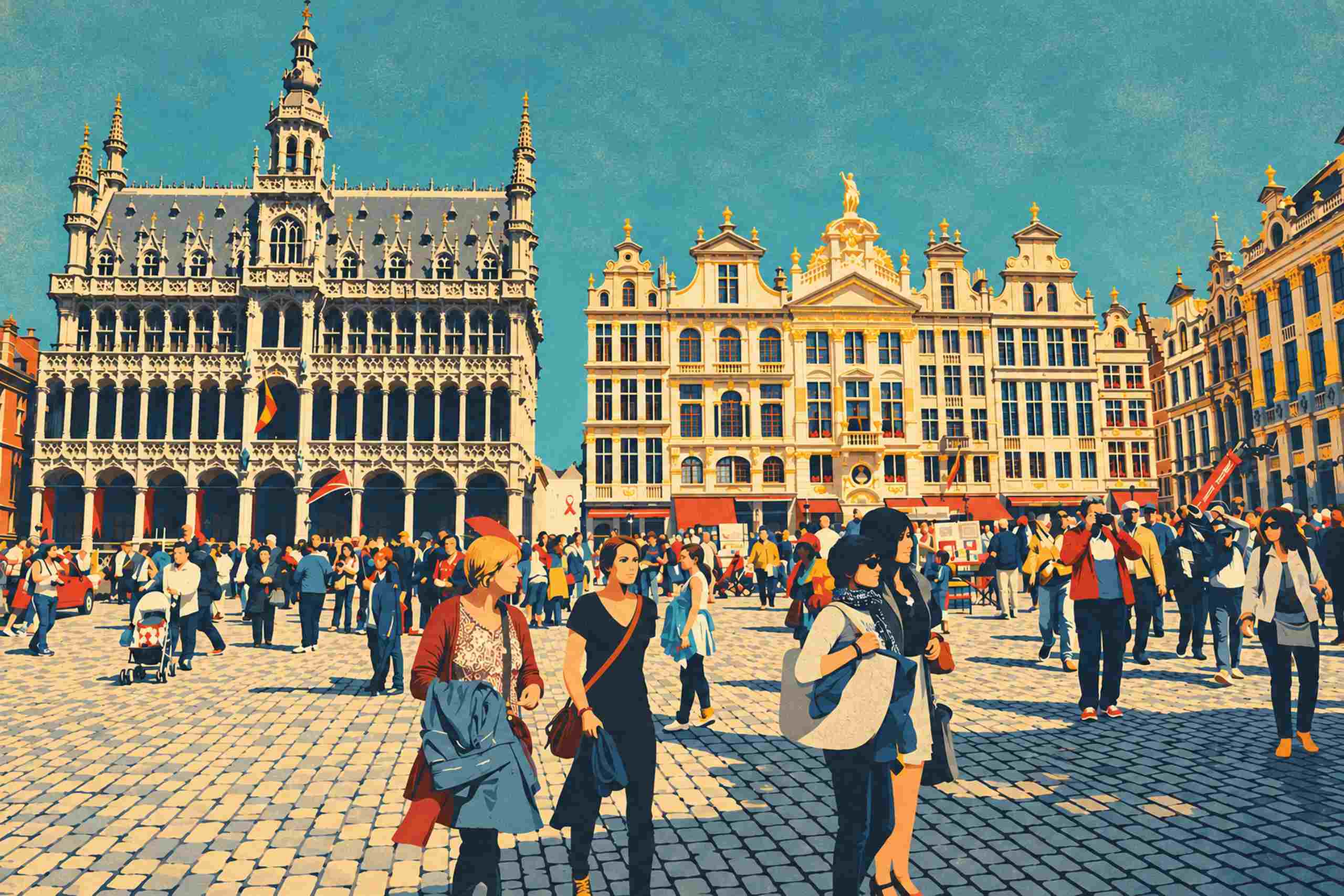
The tall Gothic facade at the left supplies the poster’s strongest architectural anchor. Its narrow central tower rises almost to the top edge, accompanied by smaller pinnacles, pointed windows and rows of decorative stonework. Posterization turns those intricate surfaces into a readable rhythm of cream edges and deep ink shadows. The open arches along the ground floor give the building a particularly weighty base, while the upper ornament appears almost lace-like against the sky. There is plenty to look at, but the limited palette holds the detail together. Step back and the facade becomes one coherent silhouette; come closer and the smaller window patterns return.
Across the center, the neighboring facades change the rhythm. Their rooflines climb and dip through curved gables, sculptural ornaments and a triangular pediment, with a small gilded figure standing above the central group. Warm ochre catches cornices, window surrounds and rooftop details, suggesting sunlight without requiring photographic reflections. Tall windows repeat in dark vertical strips beneath the pale walls. At street level, rust-red awnings create a horizontal band that ties the buildings to the crowd. The narrow gap between the Gothic building and the central group keeps a little sky visible all the way down toward the square, a useful breath between two dense areas of ornament.
The foreground gives the image its human scale. Left of center, a blonde woman in a rust-colored cardigan carries a large blue coat or bag, its folded shape occupying a generous patch of the lower picture. Beside her, a dark-clad pedestrian wears a diagonal warm brown strap. Farther right, a pale shoulder bag makes a rounded cream shape against several overlapping blue figures. The faces are simplified, but the everyday gestures remain clear. These people are walking through their own afternoon rather than posing to demonstrate the destination. That small lack of ceremony is part of the appeal.
Underfoot, the cobblestones become a remarkably effective graphic surface. Pale paving fills the left foreground, while a broad diagonal shadow carries blue-gray stones across the right. Their perspective pulls the eye back toward the buildings, connecting the closest figures with the smaller crowd in the distance. The shadow also gives the poster a solid lower corner. Without it, the bright architecture and open square might feel weightless; with it, the scene has a convincing place for the viewer to stand.
The vintage character comes primarily from the relationships between the colors. Teal and cream establish the broad atmosphere, ochre warms the stone, and faded red appears in small bursts across clothing and awnings. The darkest blue handles both architectural recesses and pedestrian silhouettes, allowing the crowd and the buildings to belong to the same printed world. Fine grain softens the flat areas, especially the open sky. It suggests the surface of an older travel illustration while leaving the image clear and lively. The artwork uses that visual language as a contemporary interpretation of the supplied photograph.
On a wall, the wide composition would suit a space where the whole square can be seen from a little distance. A narrow dark blue or charcoal frame would echo the architectural shadows; a simple warm wood frame would pick up the cream and ochre instead. A pale wall gives the teal sky room to register, while a muted blue wall could bring the warmer buildings forward. The image already contains a substantial crowd and elaborate stonework, so nearby objects can be fairly quiet. A plain lamp, a closed cabinet, a stack of travel books: enough company, really.
There is no oversized destination lettering across the sky. Brussels is carried by the square itself, by the distinctive facades and the shared public space beneath them. The finished poster keeps both parts of that experience in view: a city worth looking up at, and an afternoon busy enough to make you watch where you are going.